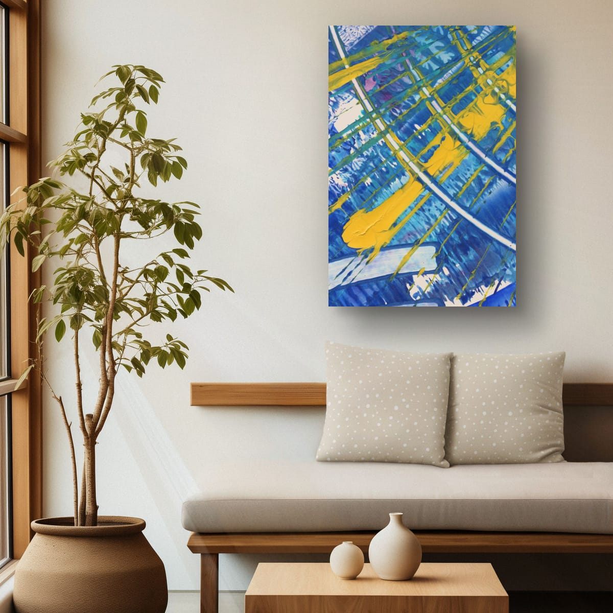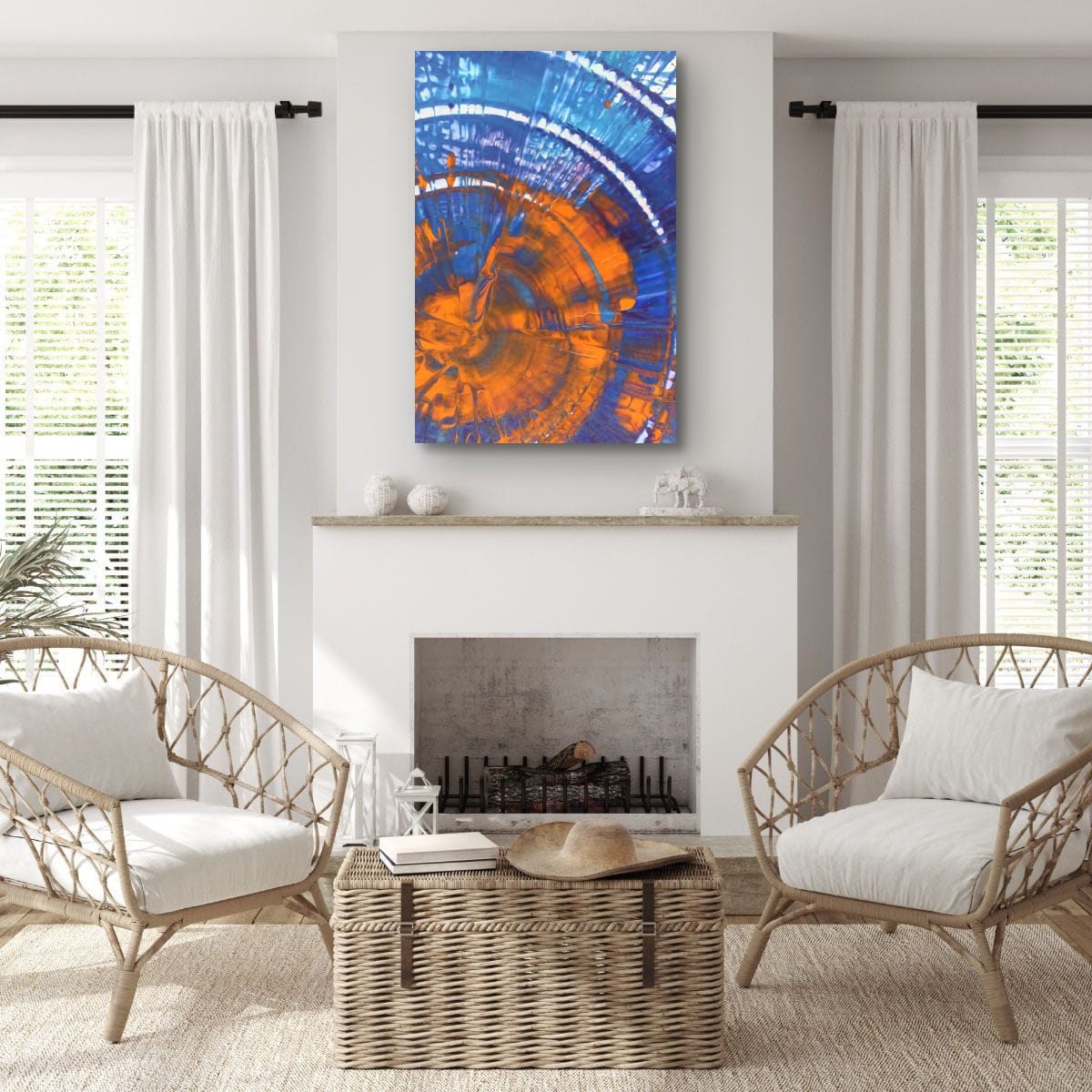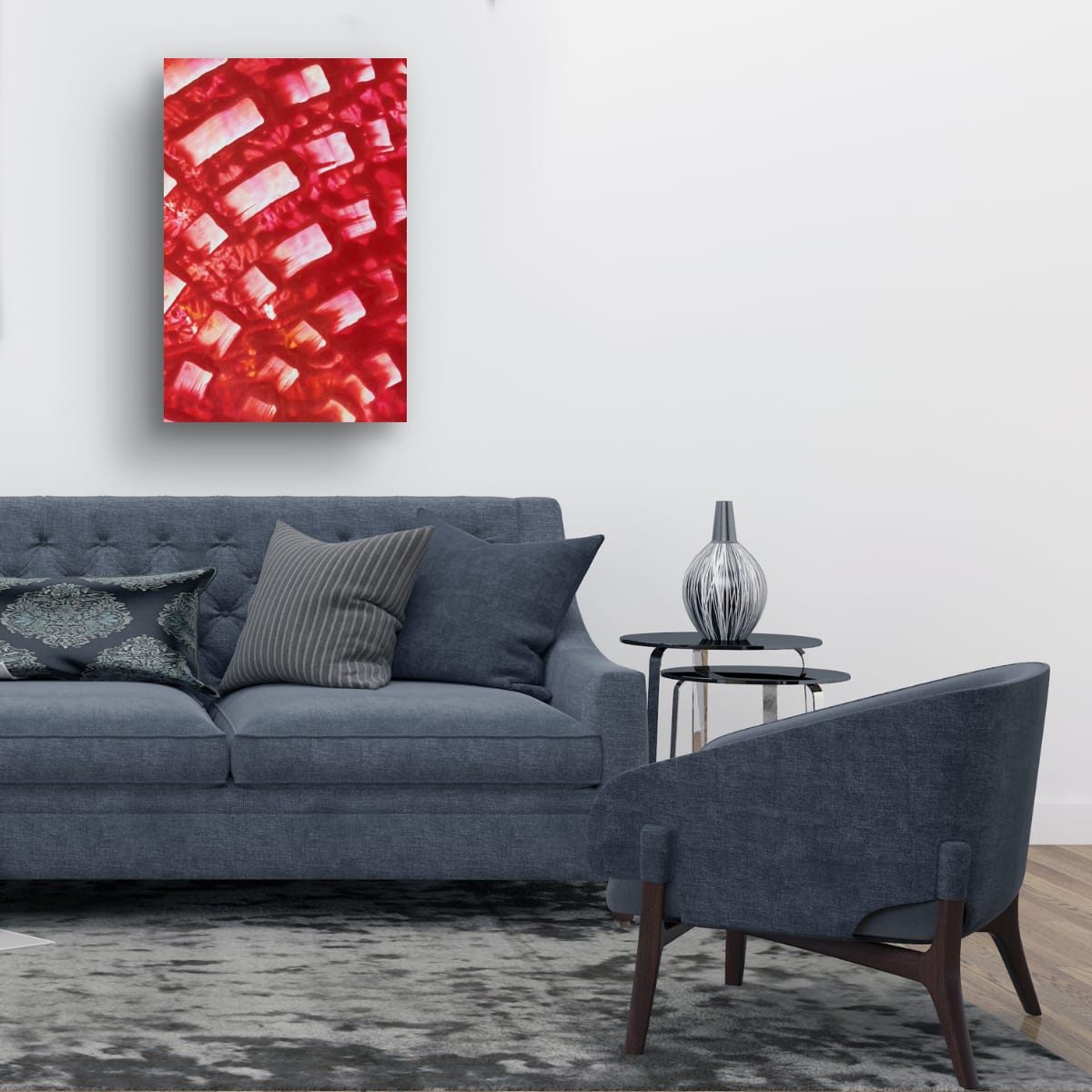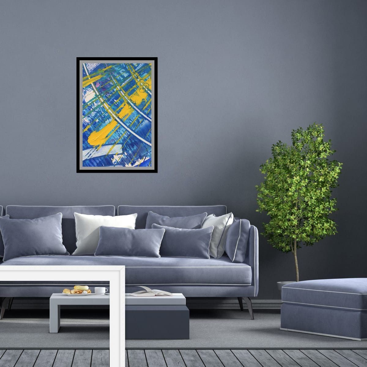
The short answer
Gray works with almost any color, but it shows off saturated colors best. On cool grays (with a blue undertone), warm accents like orange, red and yellow look especially vivid. On warm grays (greige, with a beige or brown undertone), deep blues, greens and earthy reds feel natural. The one thing to avoid is art that is as muted as the wall.
First, find your gray's undertone
Every gray leans somewhere. Hold a sheet of pure white printer paper against the wall in daylight and look at the difference:
- Cool gray looks slightly blue, green or violet next to the paper. It feels crisp and modern.
- Warm gray (often called greige) looks slightly beige, brown or pink. It feels softer and cozier.
Paint chips and the name on the can are useful too, but the paper test in your own light tells you more, because the same paint looks different in a north-facing room and a sunny one.
Colors that stand out on gray
On cool gray
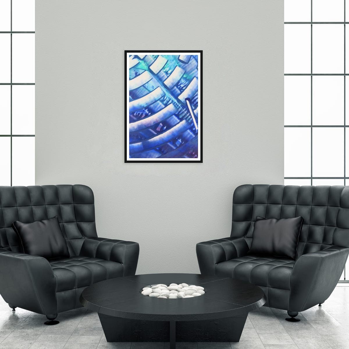
Warm colors sit opposite the blue undertone, so they glow: orange, coral, red, mustard and yellow. Deep blues work beautifully too, for a calm, tonal look, as long as the art has some contrast or a bright accent to keep it from blending in.
On warm gray
Greige is softer, so it likes colors with some depth: navy, forest and olive greens, rust, terracotta and burgundy. Very cold, icy colors can look a bit out of place on a warm gray unless the room has other cool elements.
Light gray versus dark gray
Light gray walls behave a lot like white: almost anything works, and strong colors look clean and bright. Black frames add definition.
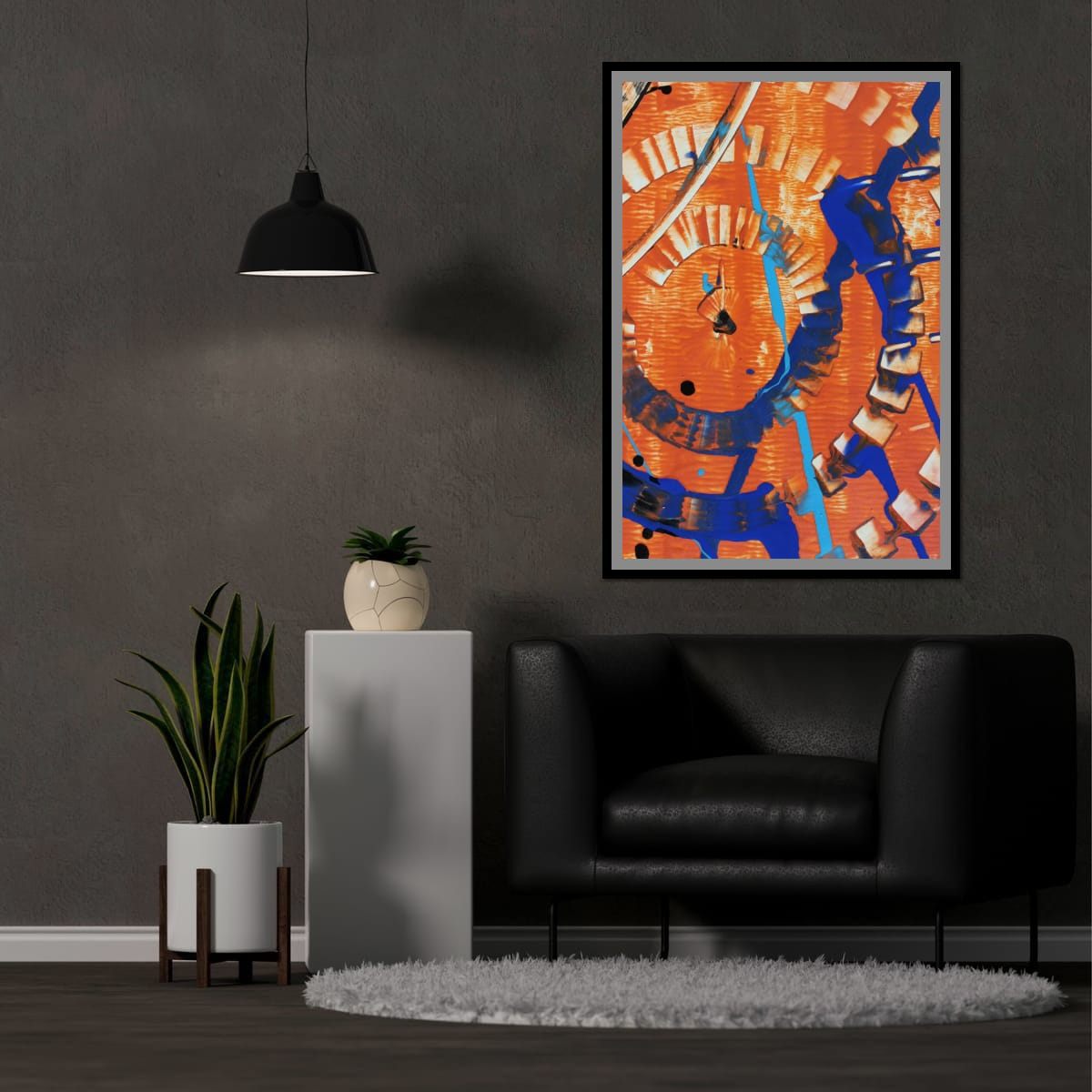
Dark gray and charcoal walls are dramatic. Colors look richer and deeper against them, almost lit from within. Bright accents, yellows, oranges, light blues and whites, read especially well. Very dark art on a dark wall can disappear, so look for pieces with light areas or strong contrast.
Frames on gray walls
- Black frames look sharp on light and mid grays and give art a graphic outline.
- White frames or wide white mats brighten a dark wall and separate the art from it.
- Natural wood warms up a cool gray room.
- No frame lets bold color meet the wall directly, which looks modern on any gray.
Gray walls room by room
In a living room, gray is a backdrop for whatever personality you want to add, and one strong piece above the sofa is often all it needs. In a bedroom, cool grays with blue or green art feel restful, while warm grays with rust or terracotta feel cozy. In a home office, gray keeps things calm and neutral on video calls, and one warm accent in the art keeps it from looking corporate. In a hallway, light gray walls with a series of colorful prints turn a corridor into a small gallery.
Test before you decide
Colors on screen are never exactly the colors on your wall. If you are unsure, hold up a printed photo or color sample of the artwork against the wall, in daylight and again in the evening under your own lamps. Gray walls in particular shift a lot between morning and night, and so does the way art looks on them.
Mistakes to avoid
- Gray on gray. Muted art on a muted wall makes both look tired.
- Ignoring the undertone. An icy blue on a warm greige can look slightly off.
- Too small on a dark wall. Dark walls make objects look smaller. Size up.
Checklist
- Test the undertone with white paper in daylight.
- Cool gray: try orange, red, yellow, or deep blue with contrast.
- Warm gray: try navy, greens, rust and terracotta.
- Dark gray: choose art with light areas or bright accents.
- Choose frames to sharpen, brighten or warm the wall.
These are general guidelines, not strict rules. Every room is different, and a few inches either way will not ruin a good wall. Room scenes are digital mockups; the artworks are details of real hand-painted paintings. Prints are offered in several sizes and formats on the shops linked from each artwork page.