The short answer
- Paper: the classic choice, usually framed behind glass. Widest framing options, best for dry rooms.
- Canvas: soft and textured, no glass and no glare. Easy, versatile, lightweight.
- Metal: vivid colors, sleek surface, very durable. A good choice where humidity is a concern.
- Acrylic: deep, glossy and luminous, with a modern look. Usually the most premium option.
The formats available depend on the shop: each artwork page on this site links to the stores where that print is sold, and each store lists its own options and sizes.
Comparison at a glance
| Paper | Canvas | Metal | Acrylic | |
|---|---|---|---|---|
| Look | Classic, fine | Soft, textured | Vivid, sleek | Deep, glossy |
| Glare | Depends on glass | Very low | Low (matte) to high (gloss) | Can be high |
| Humidity | Most sensitive | Moderate | Very resistant | Resistant |
| Needs a frame | Usually | No | No | No |
| Weight | Depends on frame | Light | Light | Heavier |
Paper prints
Fine art paper is the most traditional format and gives you the most control over the final look, because the frame and mat are your choice. A wide white mat makes even a small print look important. Paper is the most sensitive to moisture, so it should be framed behind glass or acrylic glazing, and it belongs in dry rooms rather than bathrooms or right beside a kitchen stove.
Canvas prints
Canvas has a woven texture that suits painterly images, and it hangs without glass, so there are no reflections. That makes it easy to place opposite windows and lamps. It is light and casual, and it works almost anywhere. Canvas is less sensitive to humidity than paper, but it is still a fabric and does best away from steam and splashes.
Metal prints
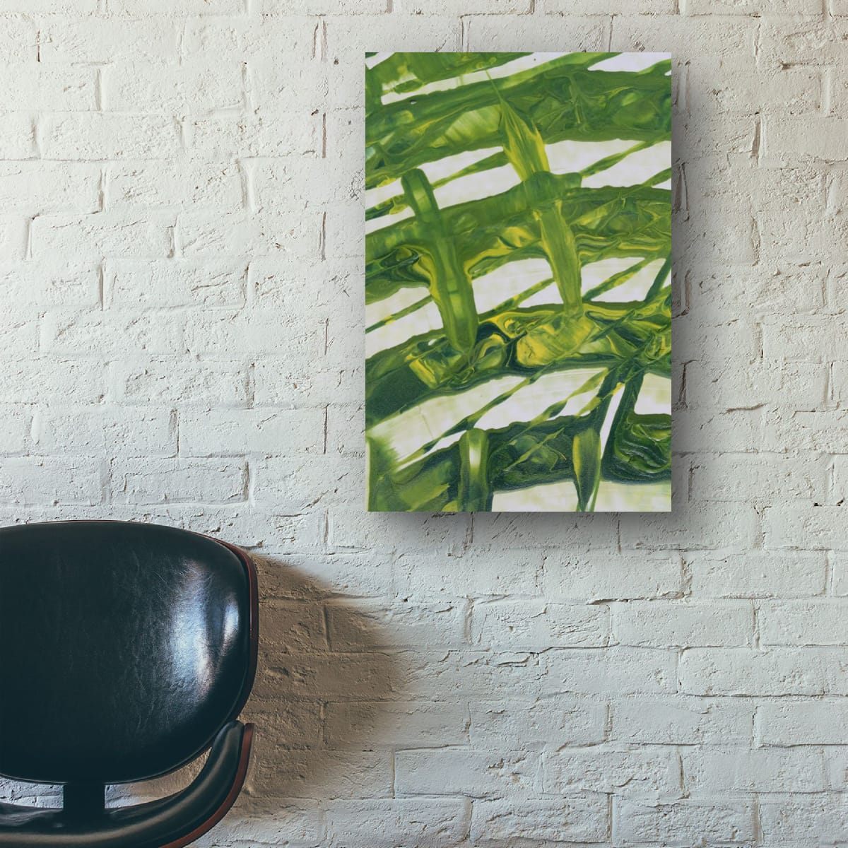
Metal prints have very saturated colors and a smooth, contemporary surface. They do not absorb moisture, which makes them one of the best choices for bathrooms, kitchens and humid climates. They are light, easy to wipe clean, and often come in matte or glossy finishes: matte for fewer reflections, glossy for maximum depth of color.
Acrylic prints
An image behind or on a thick acrylic panel gains depth and a luminous, glossy finish. Acrylic looks striking in modern interiors and resists moisture well. It is heavier than canvas or metal, and its glossy surface reflects light, so check where windows and lamps are before hanging it.
Frames and mats for paper prints
With paper, the frame is half the result. A few simple choices make a big difference:
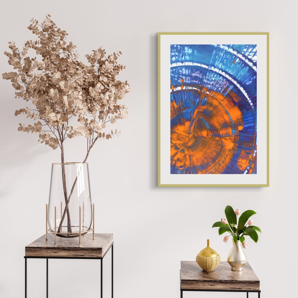
- Mat width: a wide mat, around 2 to 4 inches (5 to 10 cm) on smaller prints, gives the image breathing room and makes it look more important. Larger prints can take even wider mats.
- Mat color: white or off-white mats are timeless and let colors speak. Black mats are dramatic but can make a print feel heavy.
- Frame color: black for contrast and a graphic look, natural wood for warmth, white for a light, minimal feel, gold or brass for elegance.
- Glazing: regular glass is clear but reflective; anti-reflective glass or acrylic glazing reduces reflections and weighs less.
Size and viewing distance
Larger prints are seen from farther away, so they suit living rooms and walls above furniture. Smaller prints are seen up close, which is where surface detail and texture come into their own. Whatever the format, the size and placement rules in my other guides stay the same: start from the furniture, and keep the art close enough to belong to it.
Which format for which room?
| Room | Good choices |
|---|---|
| Living room | Any. Canvas or matte finishes if the wall faces windows |
| Bedroom | Canvas or lightweight metal over the bed |
| Bathroom | Metal or acrylic |
| Kitchen | Metal or acrylic, away from heat |
| Home office | Matte formats to avoid glare on video calls |
| Hallway | Light, slim formats that do not protrude |
Caring for any print
- Keep prints out of direct sunlight. UV light fades colors over time, whatever the format.
- Avoid heat sources such as radiators and stoves.
- Dust gently with a soft, dry cloth. Follow the shop's care instructions for anything more.
- Use proper hardware for the weight, especially for acrylic and large framed pieces.
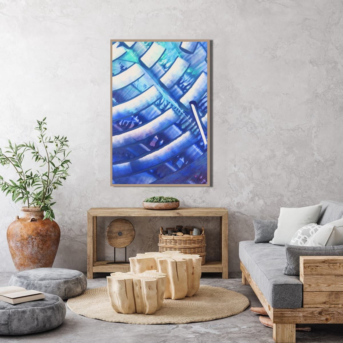
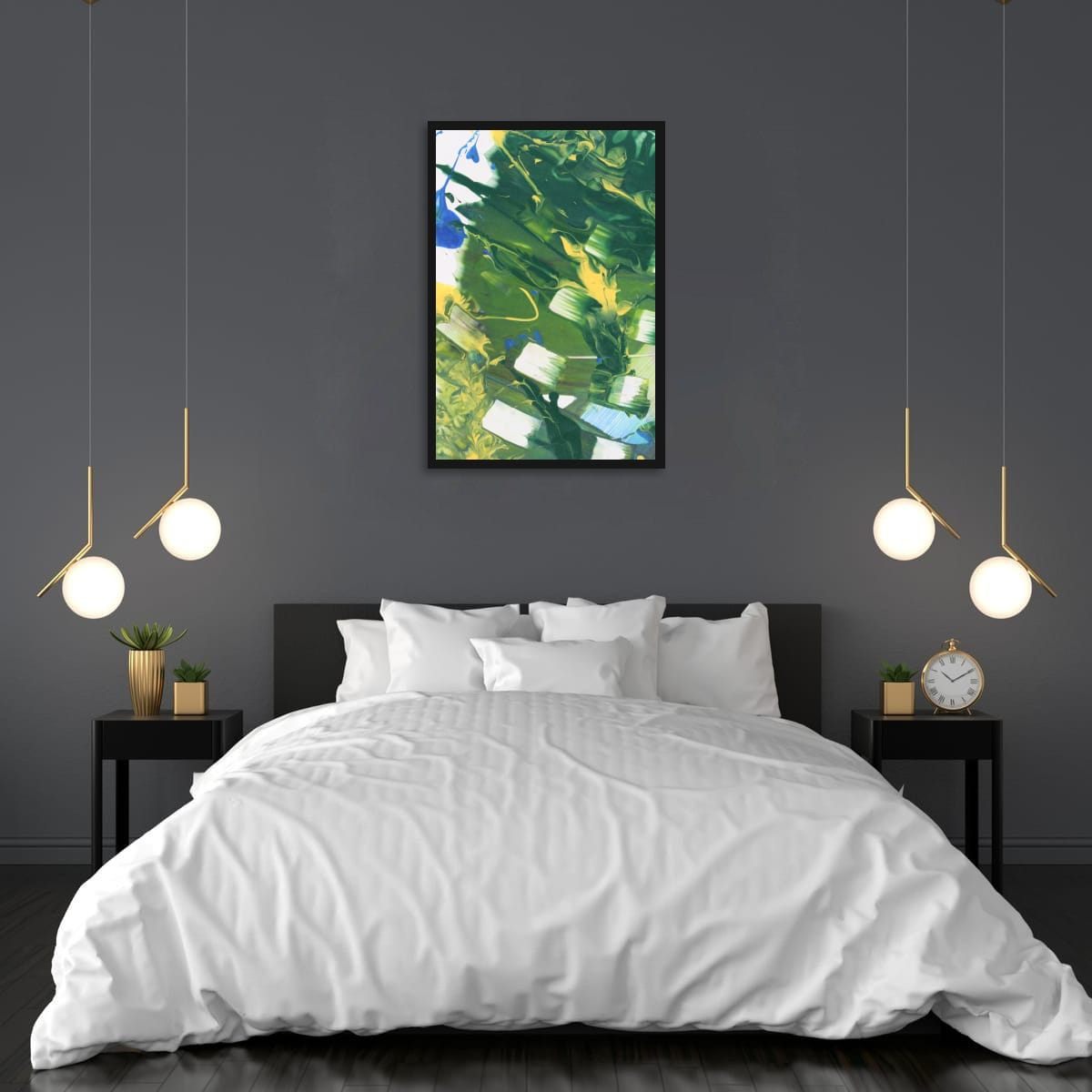
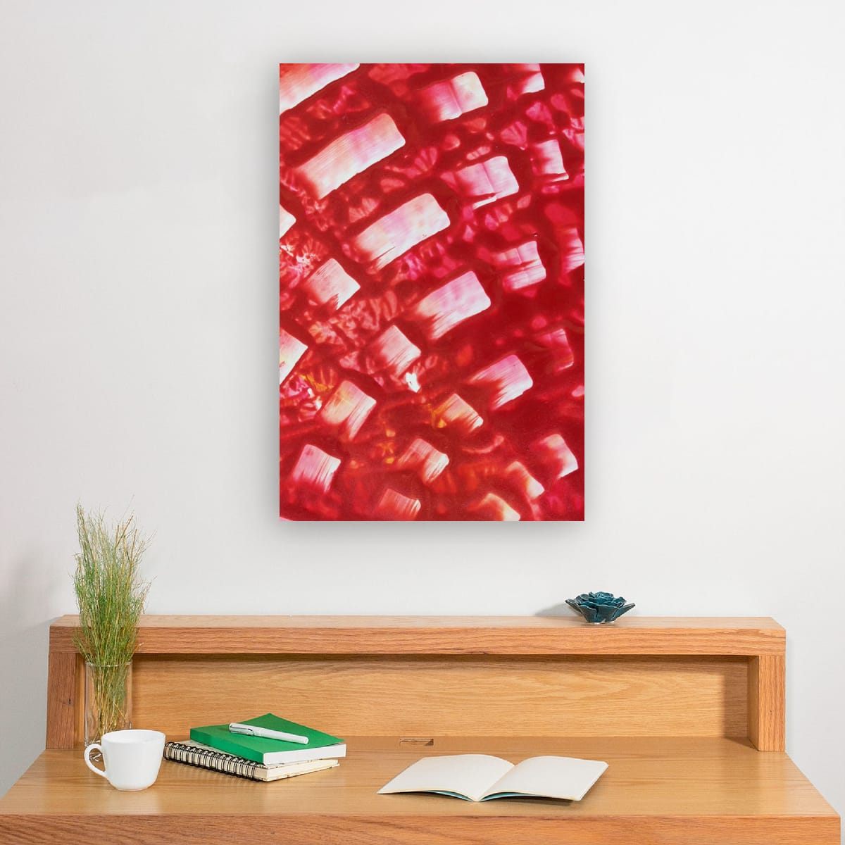
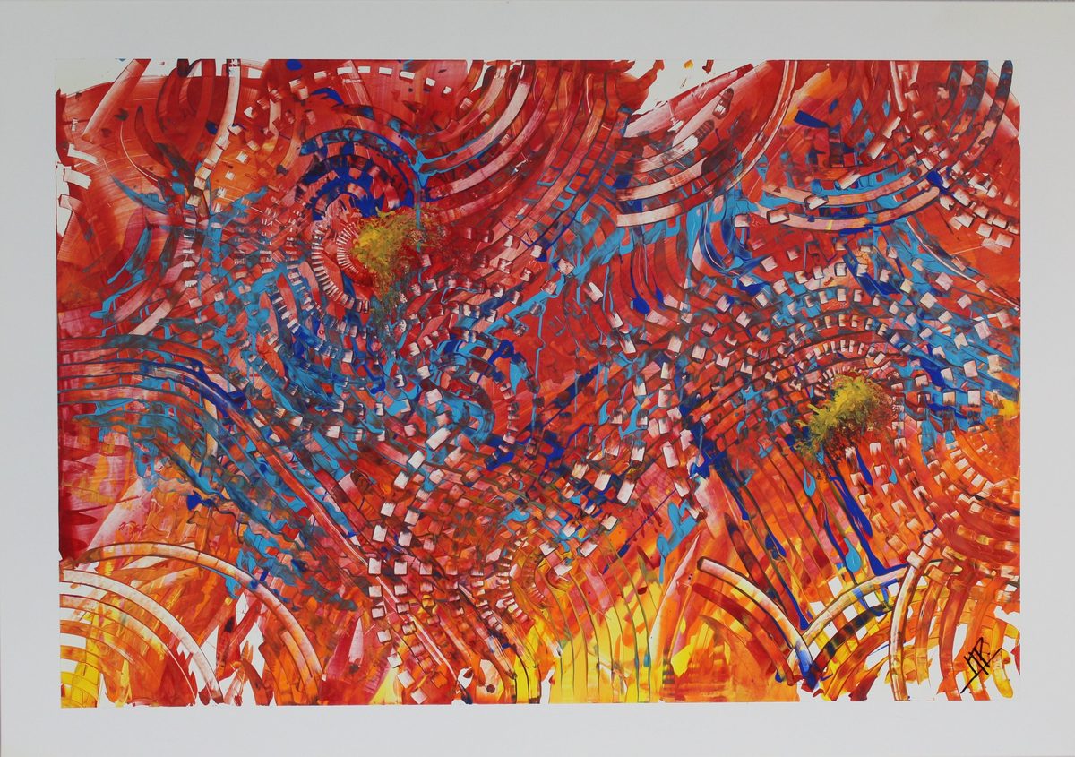
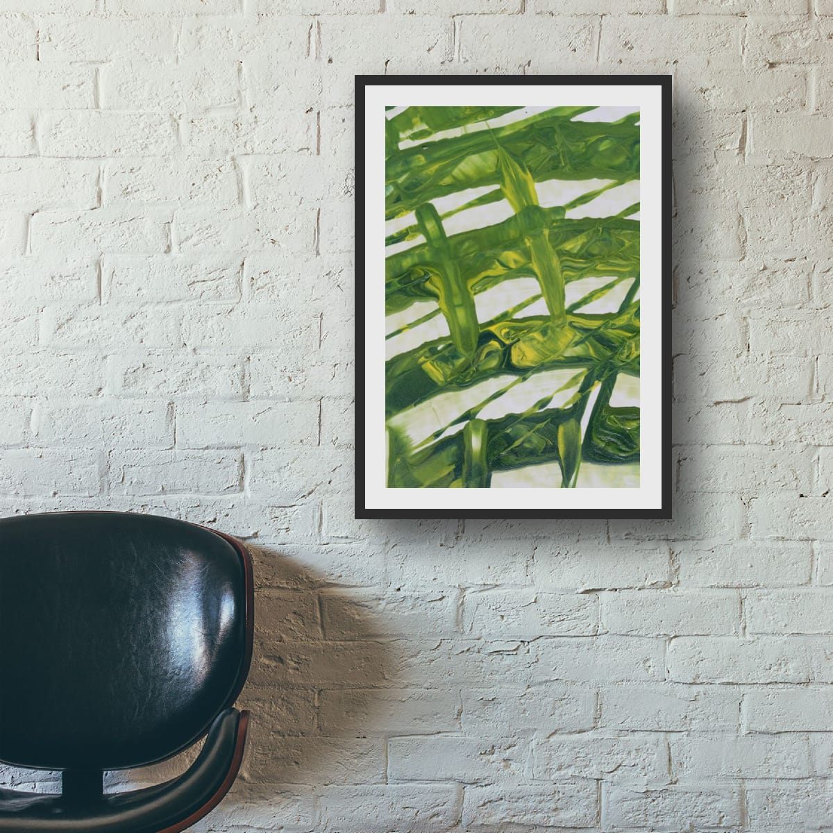
These are general guidelines, not strict rules. Every room is different, and a few inches either way will not ruin a good wall. Room scenes are digital mockups; the artworks are details of real hand-painted paintings. Prints are offered in several sizes and formats on the shops linked from each artwork page.