The short answer
Warm colors, red, orange and yellow, feel energetic, cozy and sociable, and tend to make a space feel more intimate. Cool colors, blue, green and violet, feel calm, fresh and restful, and tend to make a space feel more open. Most rooms look best with one temperature leading and a touch of the other as an accent.
What warm art does
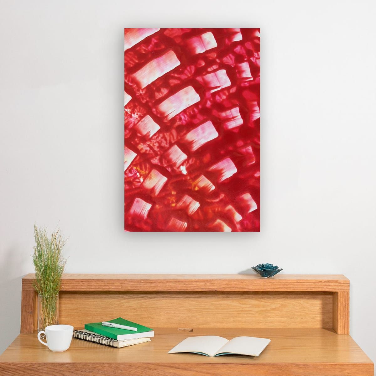
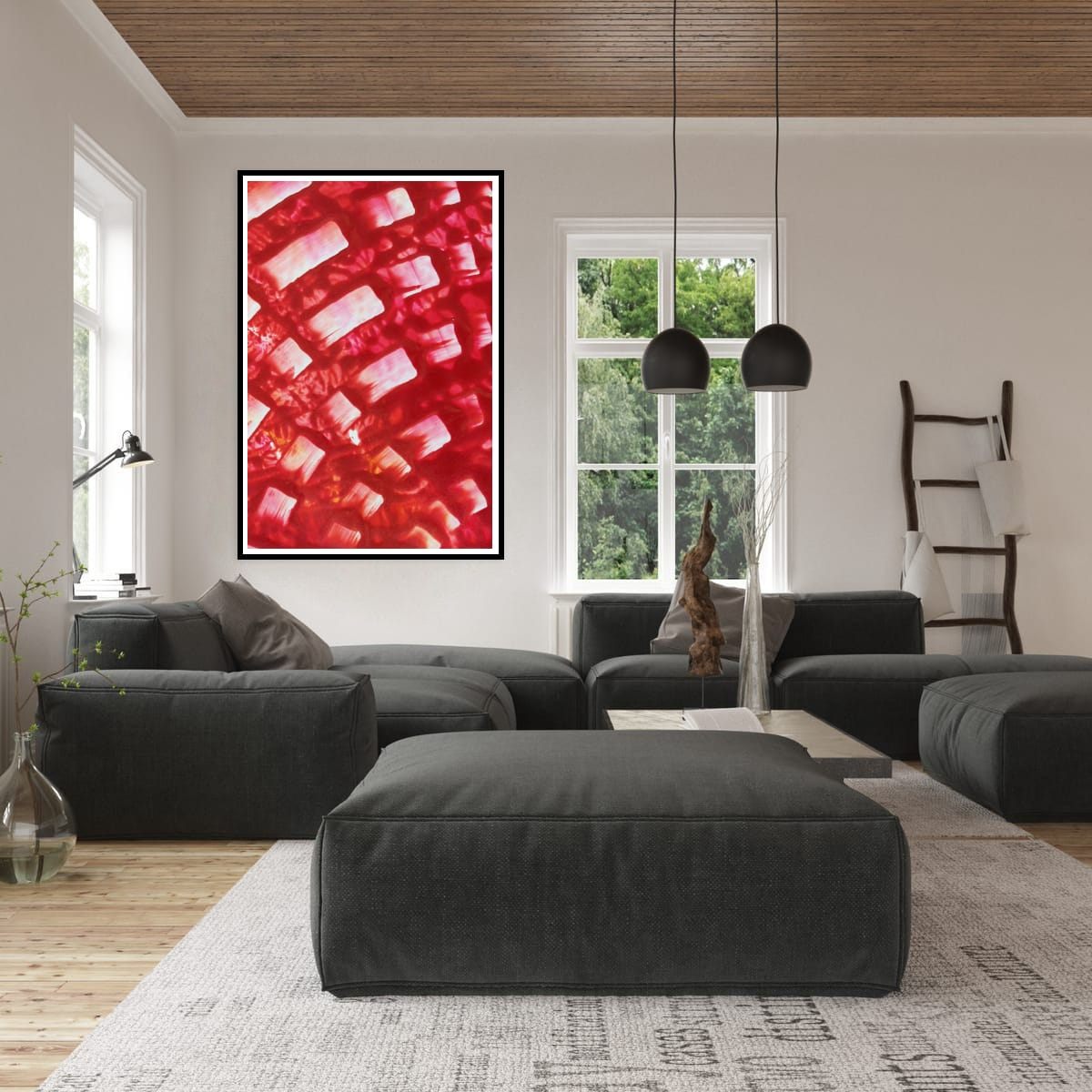
Warm colors draw the eye and seem to come forward. A red or orange piece pulls a wall toward you and makes a large room feel more welcoming. Warm art suits rooms for gathering: living rooms, dining rooms, entryways. It also looks wonderful in the evening, under warm artificial light, when reds and oranges glow.
What cool art does
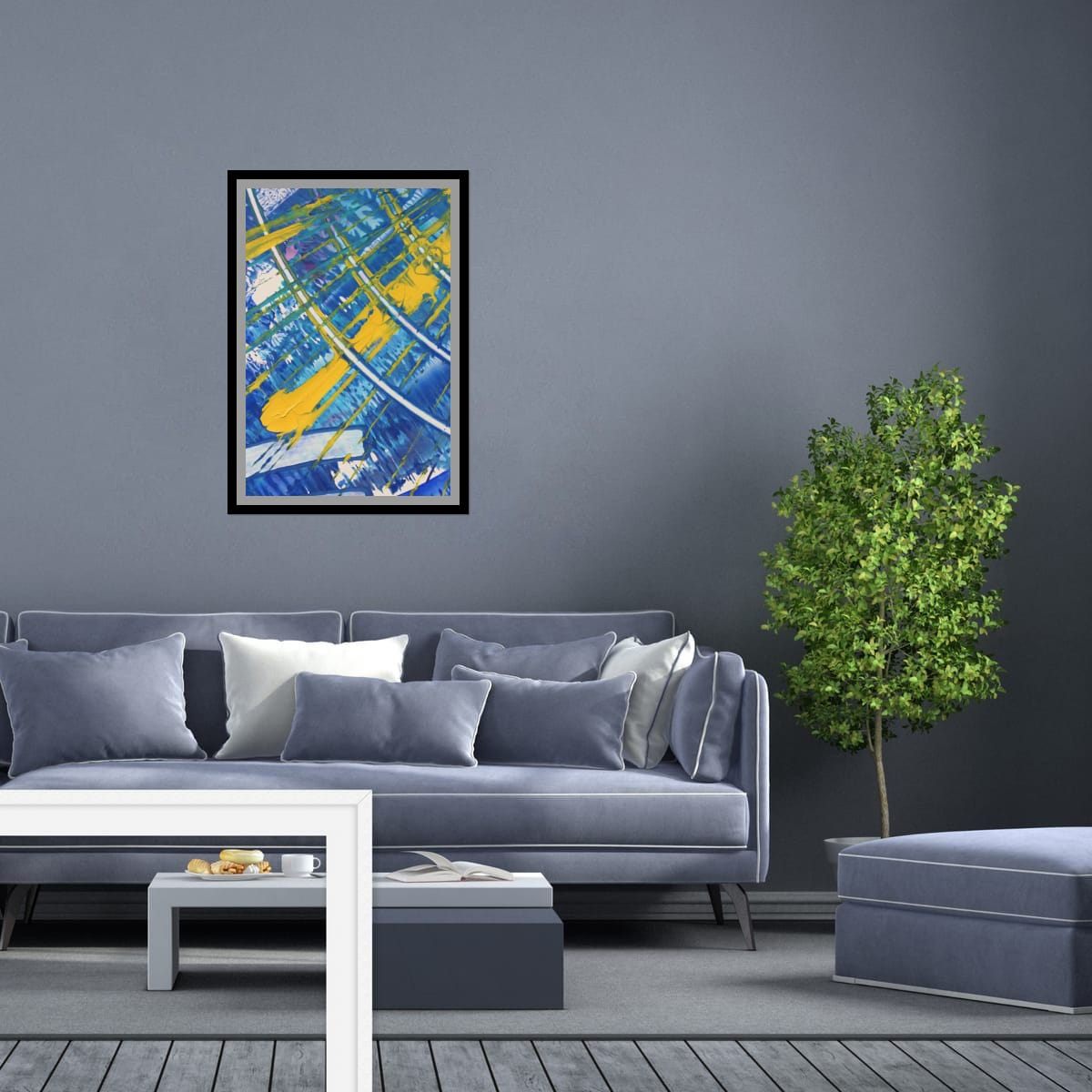
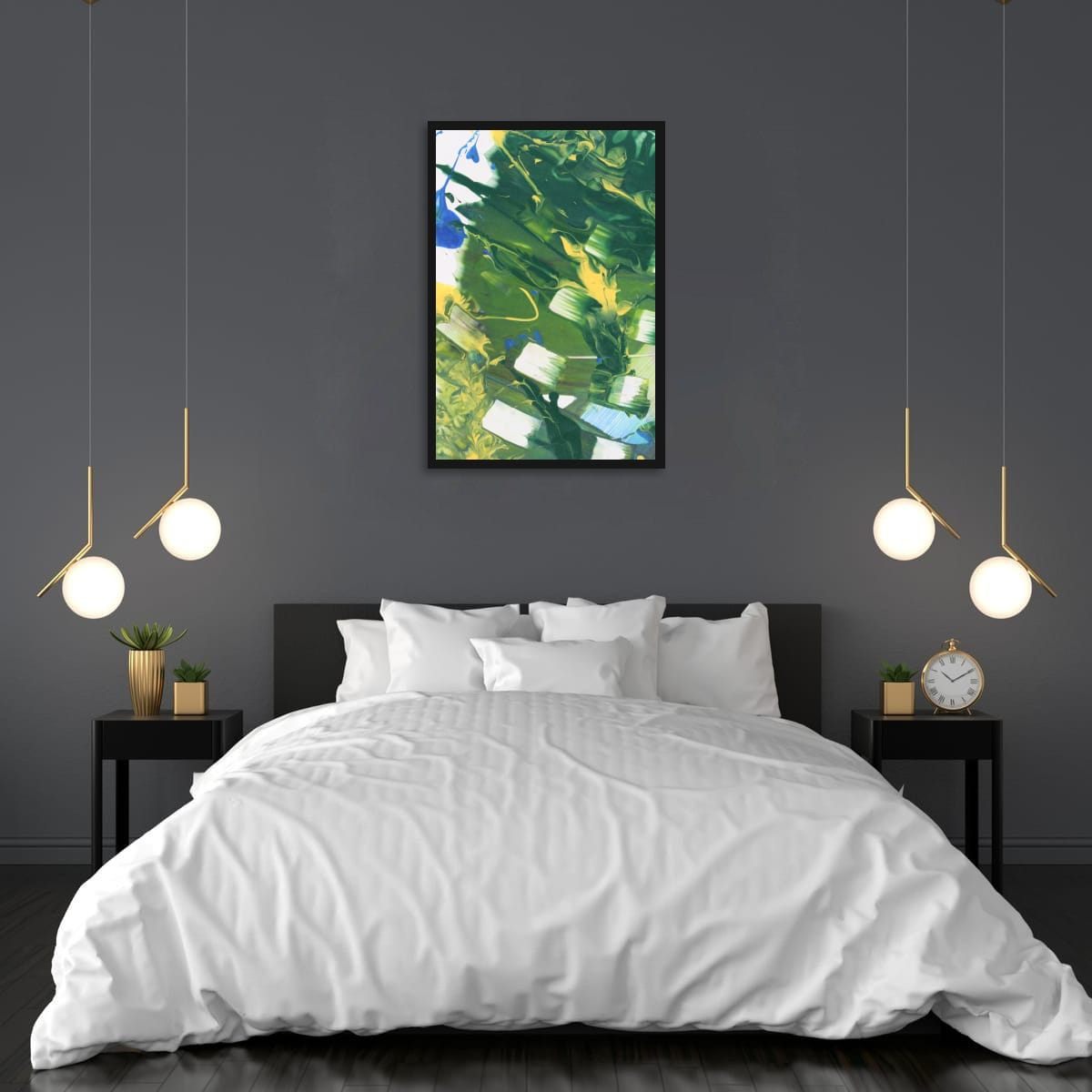
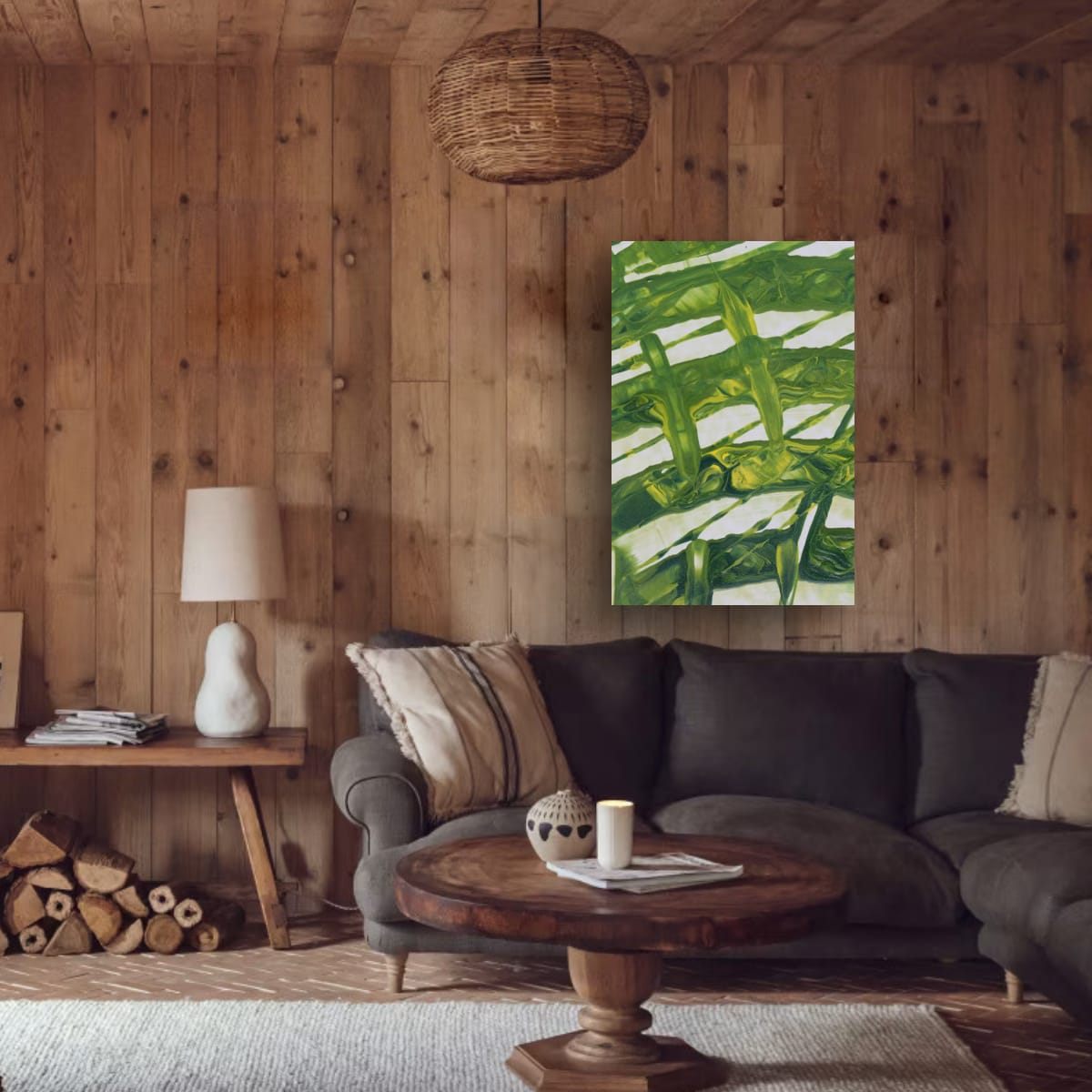
Cool colors feel calmer and seem to step back. Blue and green art opens up a small room and makes a busy space feel quieter. Cool art suits bedrooms, bathrooms, home offices and reading corners, any room where you want to slow down.
Light changes everything
The same piece looks different depending on the light in the room:
- North-facing rooms (in the northern hemisphere) get cooler, softer daylight. Warm art balances that light and keeps the room from feeling cold.
- South- and west-facing rooms get warm, strong sun. Cool art can balance the heat, and warm art becomes even more intense.
- Warm light bulbs make reds and oranges richer and can make blues look slightly duller. Cooler, daylight-type bulbs do the opposite.
If you can, look at a print's colors at the time of day you use the room most.
Mixing warm and cool
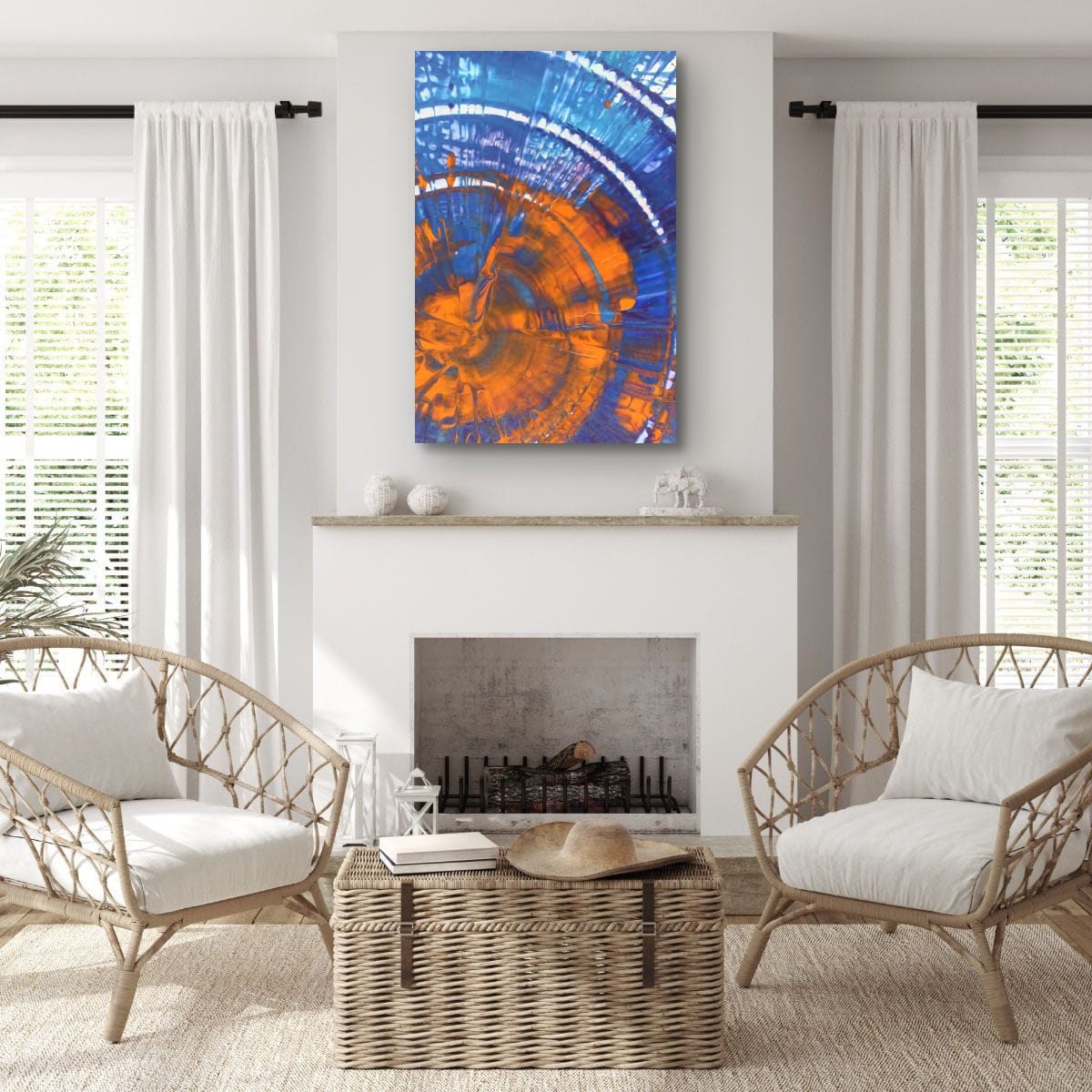
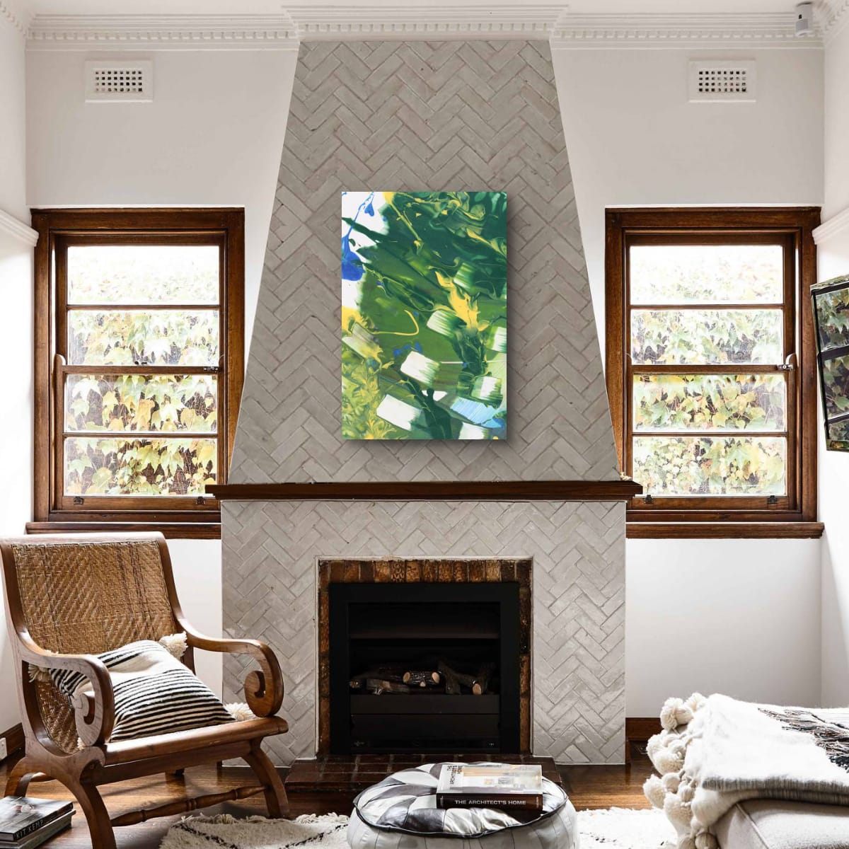
The most interesting rooms rarely stay at one temperature. A cool room with one warm piece feels inviting; a warm room with a cool piece feels fresh. Art that already contains both, such as blue with orange or green with red, is an easy way to bring balance into a room in one step.
Opposite colors across the wheel, blue and orange, red and green, yellow and violet, create the strongest contrast. Used together they make each other look more vivid.
Small rooms and large rooms
Because warm colors seem to come forward and cool colors seem to recede, temperature can help with proportions. In a small room, cool art can make the walls feel a little farther away and the space more open. A small room can also embrace warmth and feel deliberately cozy, like a reading nook or a small dining room. In a large room, warm art draws the eye and makes a big wall feel more inviting, while cool art keeps a big, bright space feeling airy.
Temperature in a group of prints
When you hang two or three prints together, keep the temperature consistent, or deliberately balanced. A pair where one piece is red and the other blue can work beautifully as a contrast, as long as both share something else, such as a third color or the same source painting. Details from the same painting usually solve this for you, because they share one palette, even when one leans warmer and the other cooler.
Quick guide by room
| Room | Leading temperature | Why |
|---|---|---|
| Living room | Either | Warm for social, cool for calm |
| Dining room | Warm | Sociable, glows in evening light |
| Bedroom | Cool, warm accents | Restful, still personal |
| Home office | Cool, warm accents | Focus with some energy |
| Entryway | Warm | Welcoming first impression |
| Bathroom | Cool | Fresh and clean |
These are tendencies, not rules. The best choice is always the one you enjoy living with.
Checklist
- Decide how you want the room to feel: energetic or calm.
- Warm art for gathering rooms, cool art for resting rooms.
- Consider the light: balance cool daylight with warm art, and the reverse.
- Add a touch of the opposite temperature as an accent.
These are general guidelines, not strict rules. Every room is different, and a few inches either way will not ruin a good wall. Room scenes are digital mockups; the artworks are details of real hand-painted paintings. Prints are offered in several sizes and formats on the shops linked from each artwork page.